Tata CLiQ Palette
Reframing beauty commerce around curation, community, and personal discovery.
Year
2021–2022
Services
Role
Digital design director
Client
Tata CLiQ
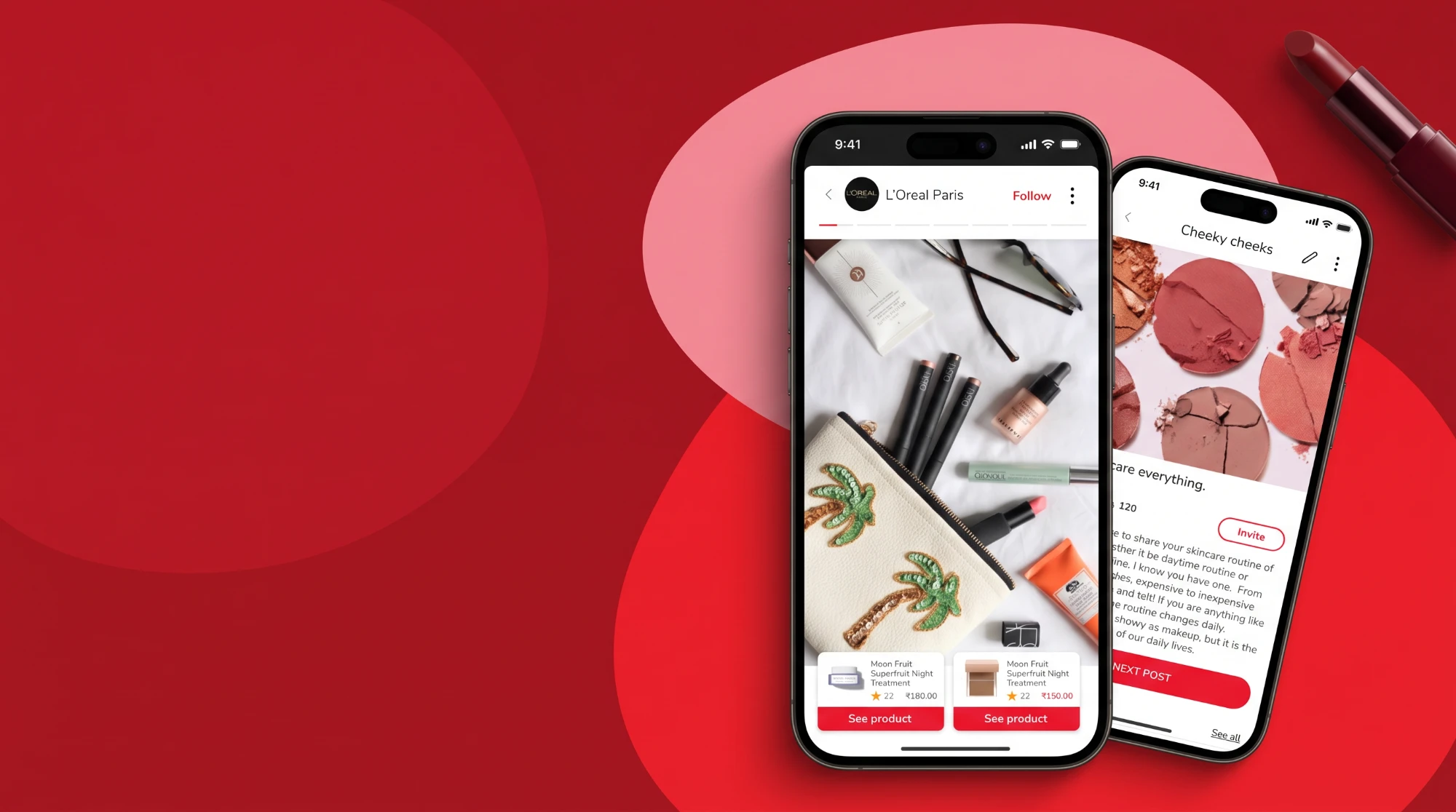
Tata CLiQ Palette: where beauty content and commerce meet
Tata CLiQ set out to build a new beauty arm for India. The brief asked for a redesigned e-commerce experience. What the business really wanted was closer to Instagram and an online store in one place: somewhere people could find inspiration, talk to each other, and buy, without switching context.
This project took that idea from first discovery through to a launched app. I led the UX journey end to end, and stayed hands-on throughout: from making sense of the client's brief, through red routes, information architecture, wireframes and usability testing, to the final UI and the design system that holds it together.
The Challenge
India's beauty market is crowded, and most digital beauty products sell the same way: a catalogue, a search bar, a few reviews. Social apps inspire but don't sell. Stores sell but don't inspire.
Tata CLiQ wanted both in one product, with personalisation at its core. The client's requirements arrived as more than 210 user stories, spanning feed, posting, groups, bag and checkout, and account, and had to fit what the existing commerce platform could support, all while a brand was being built around the idea of "Your Beautiful Obsession".
The question was not how to design every story. It was where social and commerce should meet, and how to keep each from getting in the other's way.
The Response
Treat personalisation as the system the whole product is built on, and make content and commerce share the same surfaces: the same search, the same posts, the same profile.
Starting with the proposition
Before any screens, discovery covered numerous interviews with people from the target audience, benchmarking of the best personalisation, community and gamification in the market, and a review of the brand audit the client had shared.
People wanted a brand that knew them beyond skin type, recommendations they could trust in a market flooded with products, and a quick, painless path from reading to buying. That shaped a product vision with three directions: in-depth data capture, community, and repeatable engagement. Discovery also surfaced four engagement tactics that were not in the original requirements: gamified progress, live and short-form video, and progress tracking.
From 210+ user stories to a usable structure
The brief came as a long list, not a structure. The first job was to work through every one of the 210+ user stories, separate what any store needs from what would make this product different, and find the journeys the whole product depended on.
Those became the red routes, the paths that had to work first time for the product to succeed. The information architecture was built around them, then tested as wireframes before any visual design was committed.
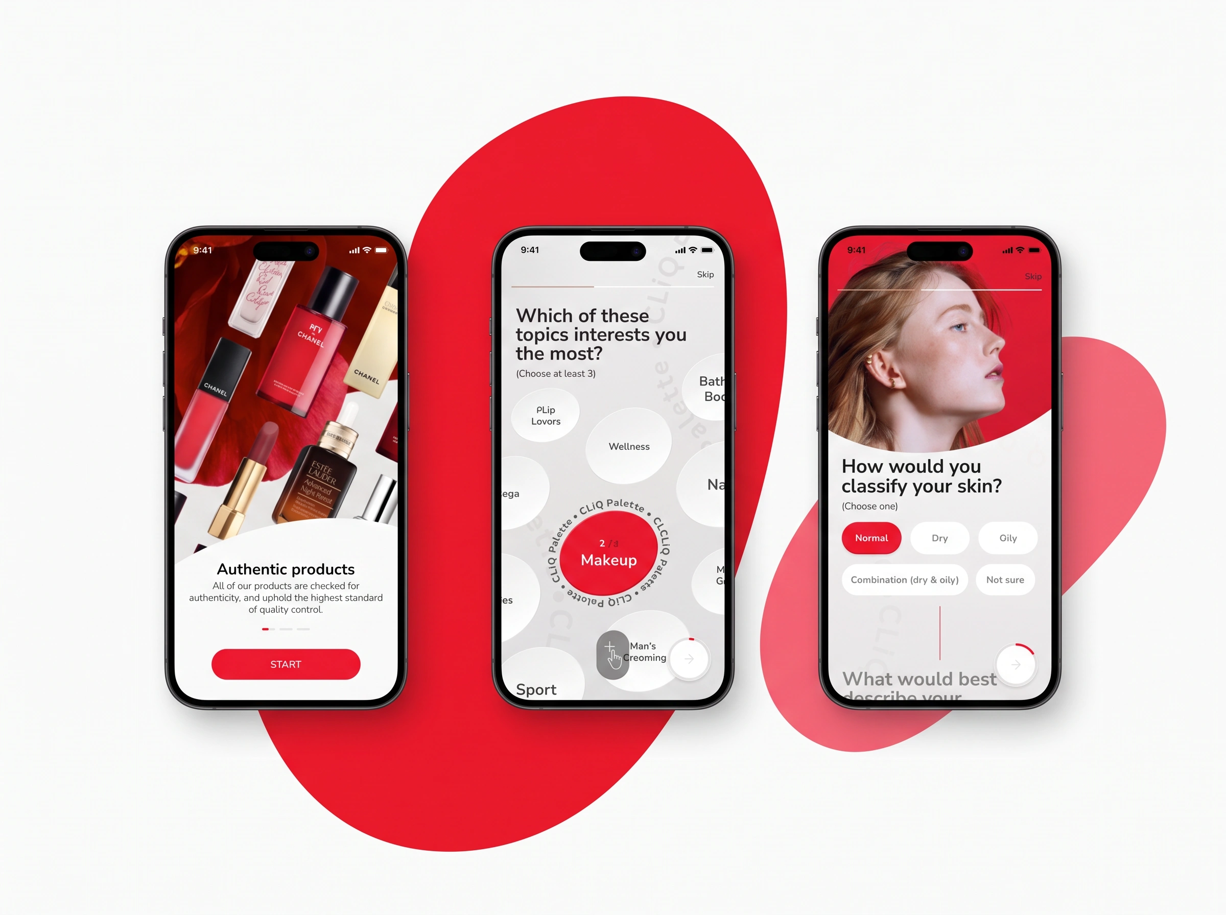
Learning about people without losing them
Rich profiles make personalisation work, but long sign-up flows lose people before they begin. The onboarding asks for the minimum first and learns the rest over time.
One phone-number entry decides whether someone is new or returning, so existing customers skip onboarding altogether. New users answer a few questions, can skip any of them, or can browse as a guest without signing up.
Testing before the design was finished
I planned and ran the first round of remotely moderated usability testing in March 2021, on early wireframes, with 13 tasks across shopping, social and account features, and wrote up the results.
The average task completion rate was 87.96% (95.38% counting pure completion), above the 80% success threshold used in this kind of testing. The three lowest-scoring tasks produced specific changes: "Forum" became "Groups", "Saved" became "Saved posts" with a clearer route to the wishlist, and private and public groups were made visually distinct. Smaller details were fixed too, such as moving the image counter away from the "Next" button in the posting flow.
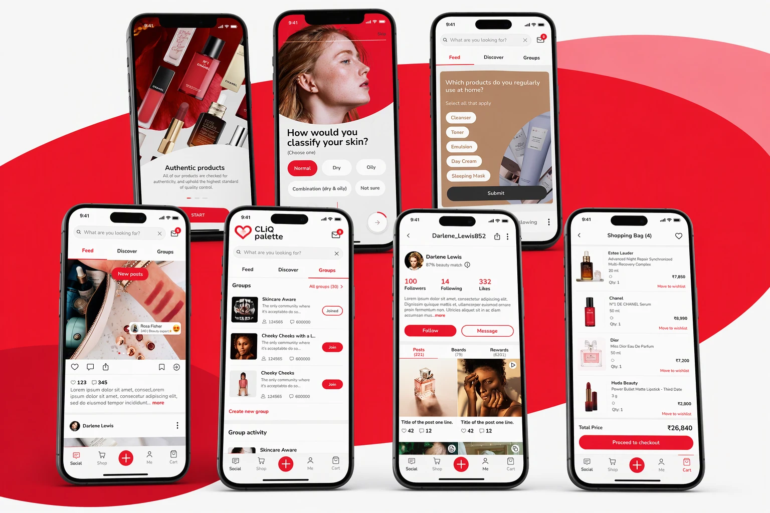
The app at a glance: onboarding, feed, curation, community, profile and bag
Rather than design every screen to the same depth, the effort went into the flows that make this product different from a store or a social network.
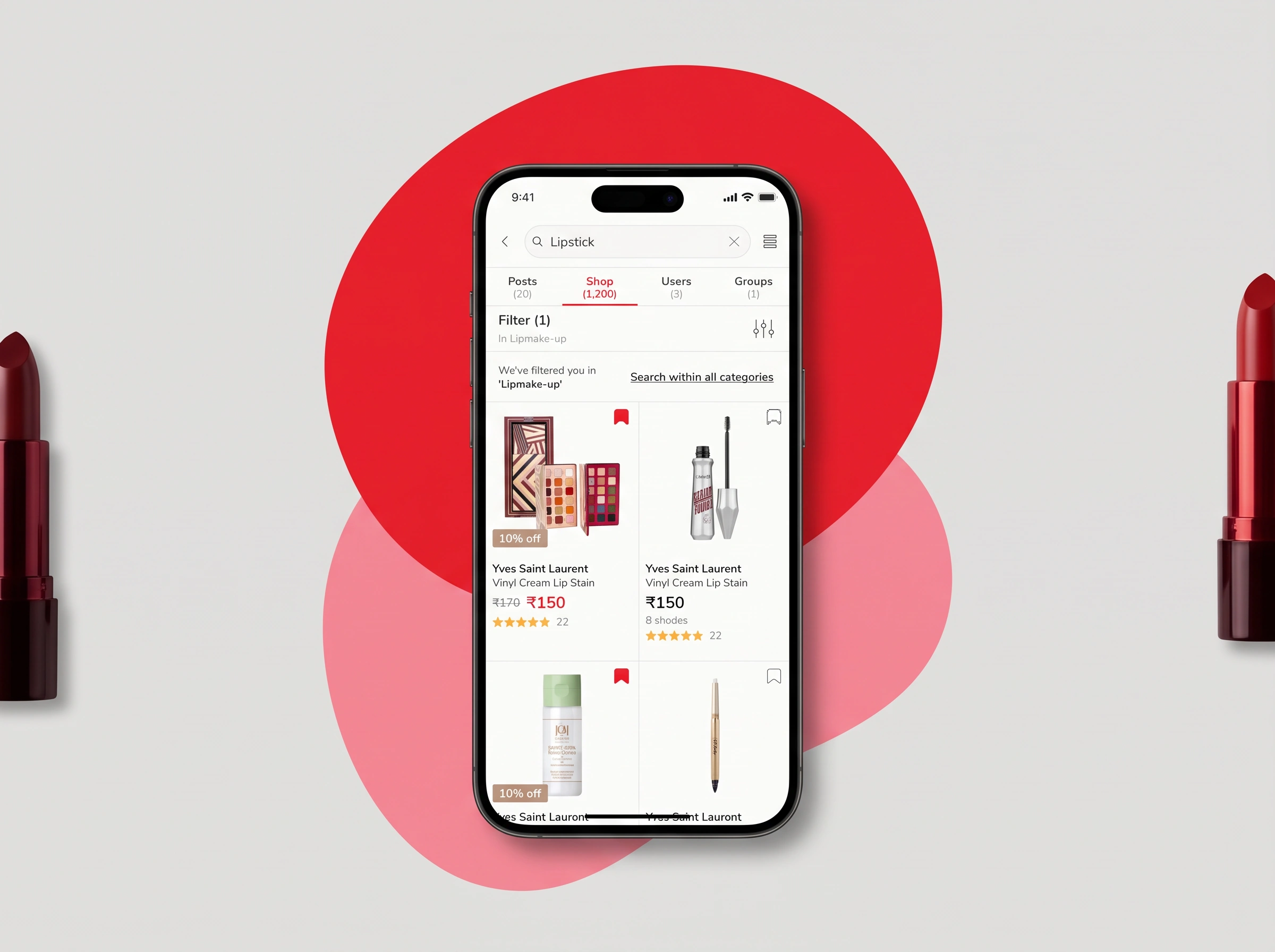
One search across content and commerce
Search had to serve a shopper looking for a specific lipstick and someone exploring what others are posting. A single search field returns results in separate tabs for posts, shop, people and groups, with counts on each, so a query like "lipstick" shows everything the platform knows about it without leaving the search.
Filters and "search within all categories" keep the shop results precise, while the other tabs keep the community side discoverable.
A community that also sells
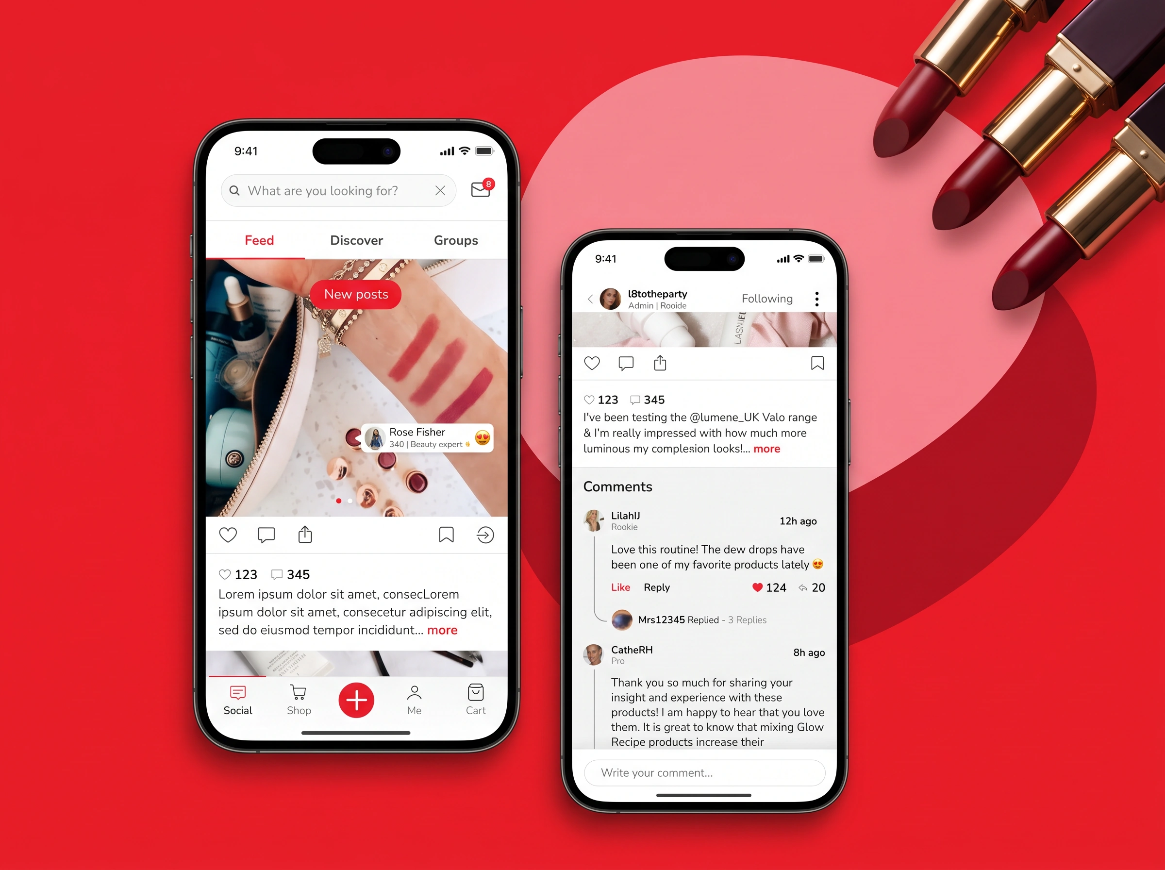
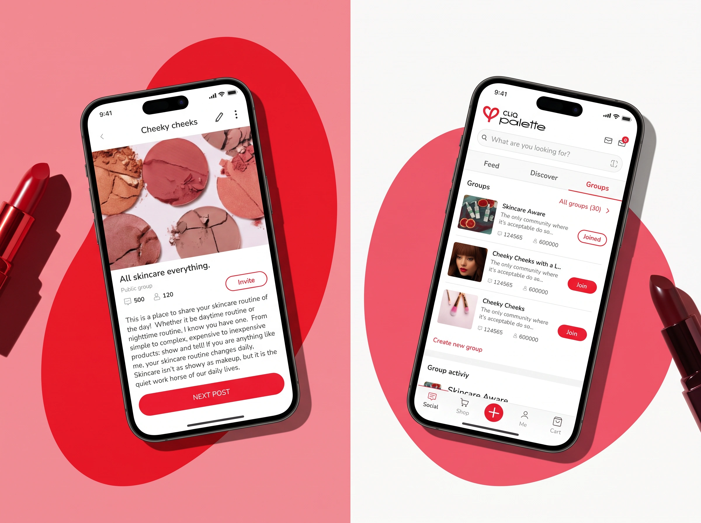
The social layer is built to support the business as well as the audience. Feed, stories and posts give people inspiration from brands, experts and each other. Groups and a message board give beauty enthusiasts a place to talk through common needs, and give brands a platform to reach a new audience.
Posting and sharing, built for products
Anyone can post, and posting is designed to connect content with commerce. Creators tag products straight from the catalogue, add an emoji reaction to show how they felt about it, tag people from their network, and place tags directly on the photo. When someone views the post, the tagged products appear alongside it with prices and ratings, one tap from the shop.
This kept sharing simple for creators and gave brands a way to appear in the places people already look for ideas.
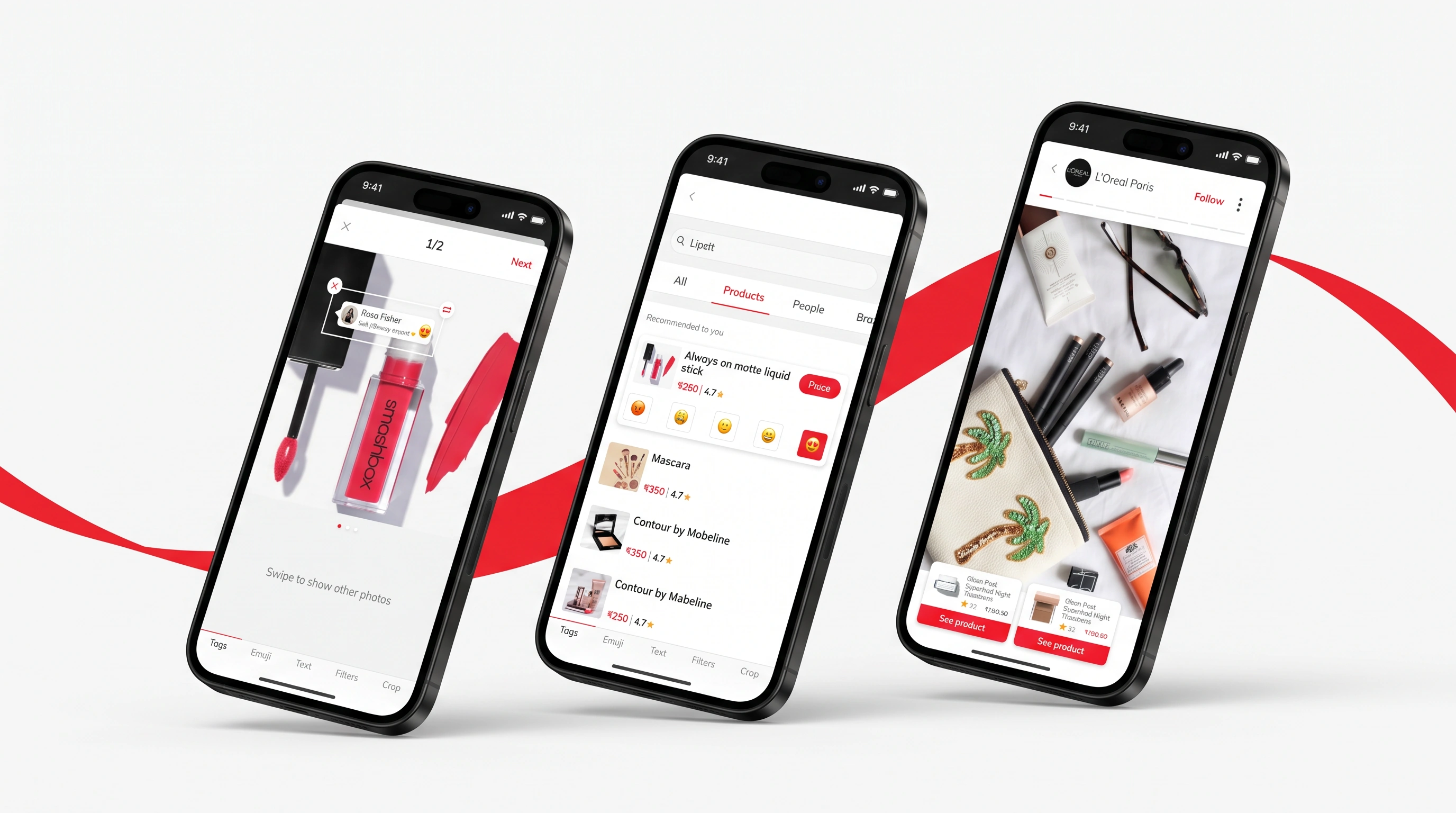
Tagging products and people in a post
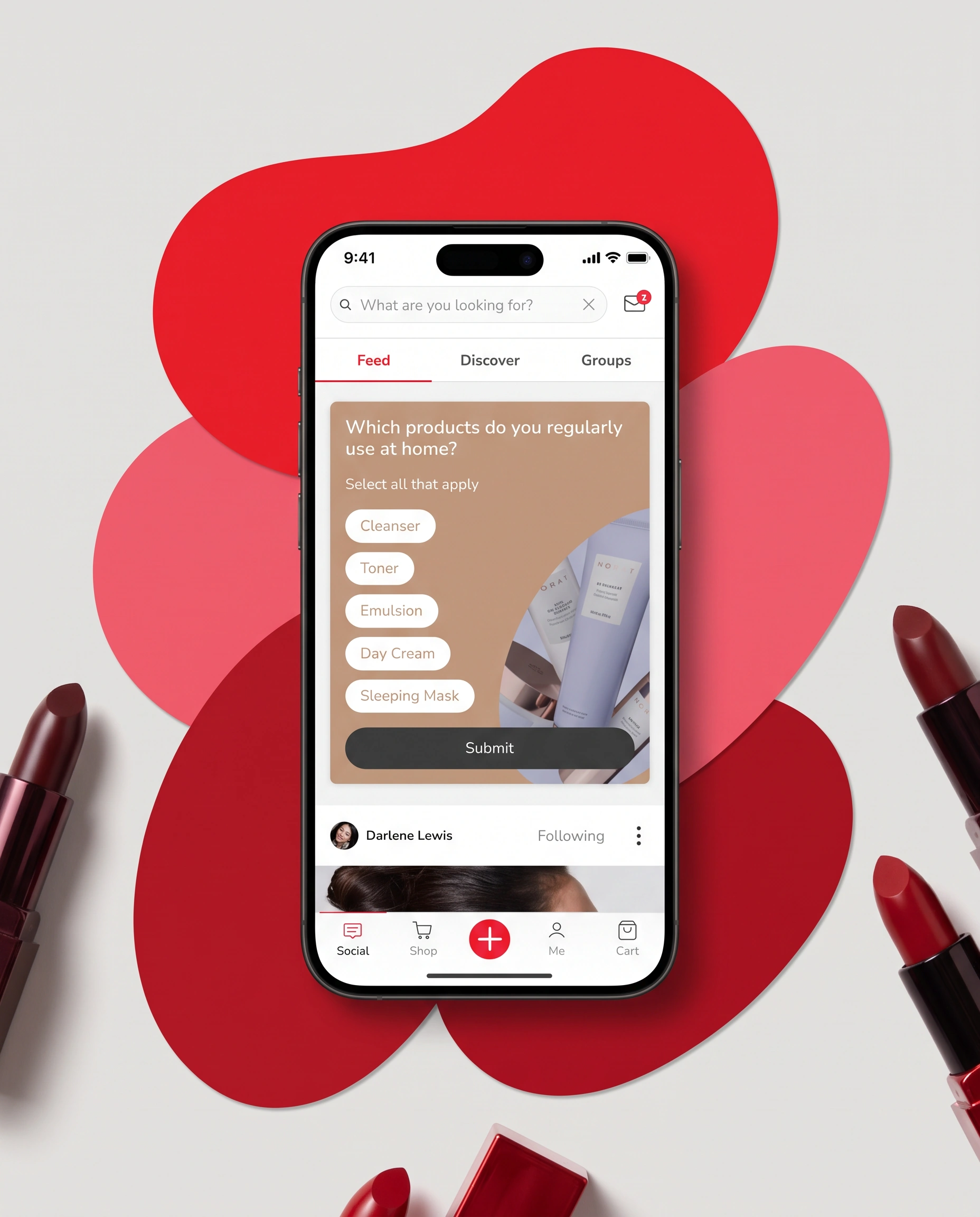
Curation woven into browsing
Curation is the backbone of the app. Short preference questions appear inside the feed itself, between posts, so the app learns about each person without a long form. A small set of question types covers text, image and text-plus-image choices, single and multiple selection, sliders and free input. Once a question is answered, the card disappears and the next post moves up.
Banners follow the same logic: hero, split, product and time-limited offer banners adapt to the grid so merchandising and content share one scroll.
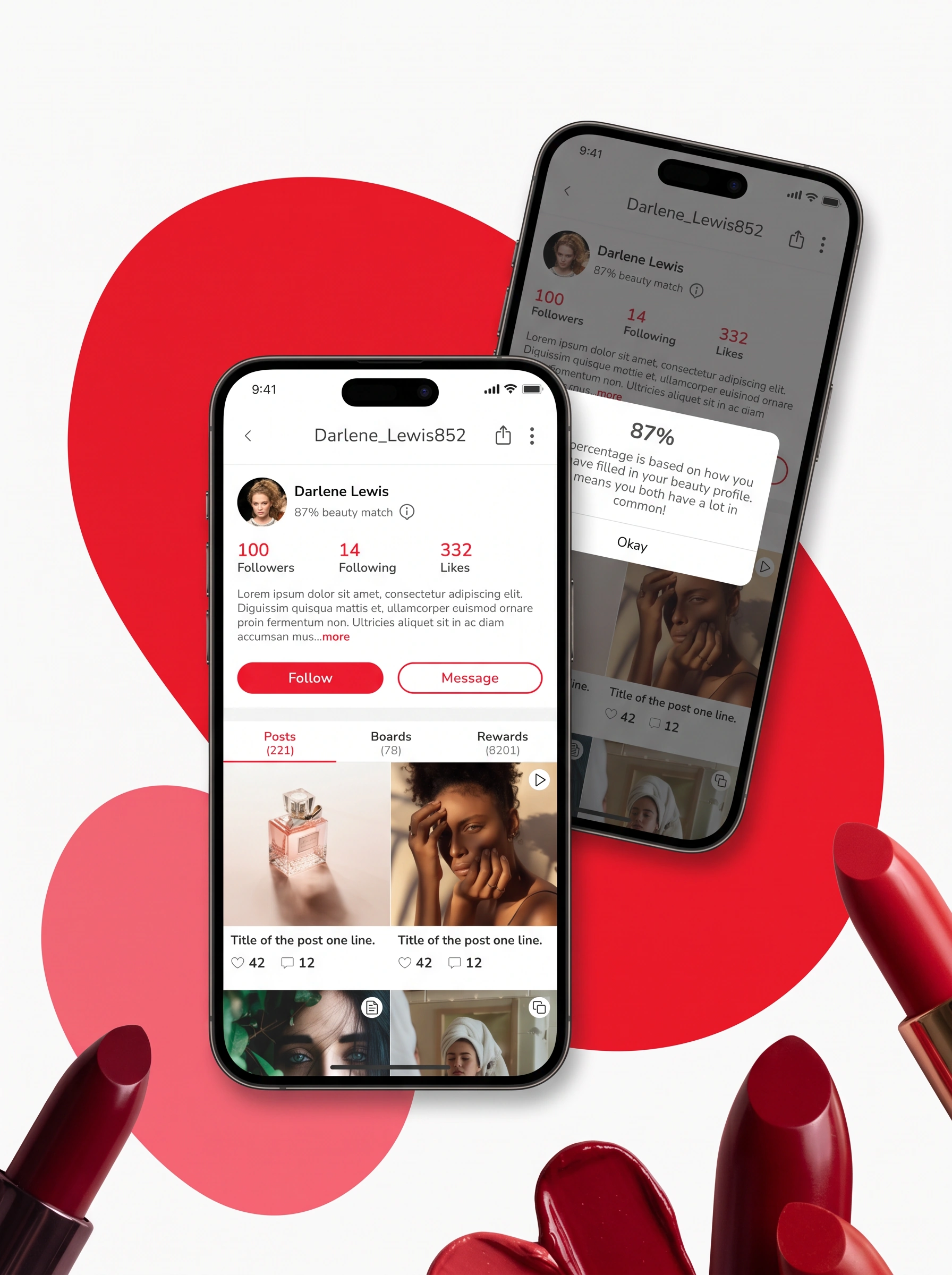
A profile that makes reviews more relevant
Every answer feeds a beauty profile that shows how complete it is, section by section: face, sensitivity, hair and scalp, body, sleeping habits, lifestyle and brand preferences. The more complete it is, the more the app can tailor.
That profile does real work in the shop. Reviews show a match score next to the reviewer, so a review from someone with similar skin or hair carries more weight than an anonymous one. Personalisation is applied to social proof, not just to recommendations.
An optimised checkout
Checkout was designed around reducing friction and surfacing value. Delivery estimates come first, based on the customer's pincode. Quantity controls are simple: a visible trash icon at quantity 1, which tested at 100% task success, and a minus above that. The checkout button stays at the bottom as users scroll, and savings and free-gift thresholds are shown in the bag, with coupons validated in place.
Clear states cover the awkward moments too, like items that don't ship to a chosen address, gift wrap with a personal message, and low-stock warnings.
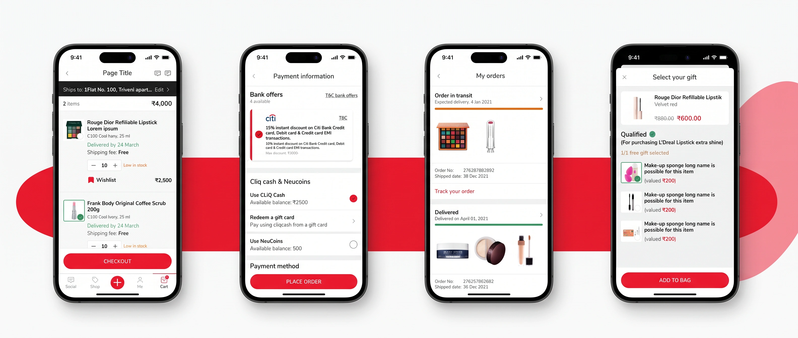
Bag, payment, order tracking and free gift selection
A system built to scale
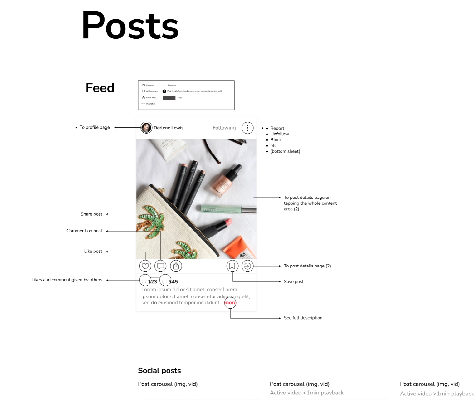
Behind the screens sits a design system with a TATA CLiQ red scale, neutrals, semantic colours checked for accessible contrast, a type scale, a grid and a component library for mobile and desktop.
Even a single post is documented: profile, follow state, report and block options, like, comment, share, save, details and expandable captions. Every post type behaves the same way, and developers get one reference.
Designing for how the app meets the store
Tata CLiQ Palette was always meant to live beyond the screen. Alongside the retail team's work, I looked at how the app should connect to in-store experiences, and how a customer's profile, wishlist and saved looks could travel between the two. The store design itself was handled separately.
Three months after launch, the app had passed one million downloads on Google Play, held a 4.9 rating there, and ranked 51st in the App Store's Shopping category. Reviews kept coming back to the same things: a clean interface, a personalised profile, and content that feels like an Instagram made just for beauty.
1m+
Downloads on Google Play within three months
4.9
Google Play rating
#51
App Store Shopping category ranking
88%
Task completion in first usability test
Leadership and hands-on value
This project asked for both. It sat between a business wanting a differentiated beauty destination, a brand being created in parallel, and a platform with real technical limits, so it needed someone to connect those layers.
I led the whole UX journey and did much of it myself: working through 210+ user stories, mapping red routes, defining the information architecture, wireframing, planning and running usability testing, and designing the UI and the system behind it. The aim throughout was to make personalisation feel like help, not paperwork.