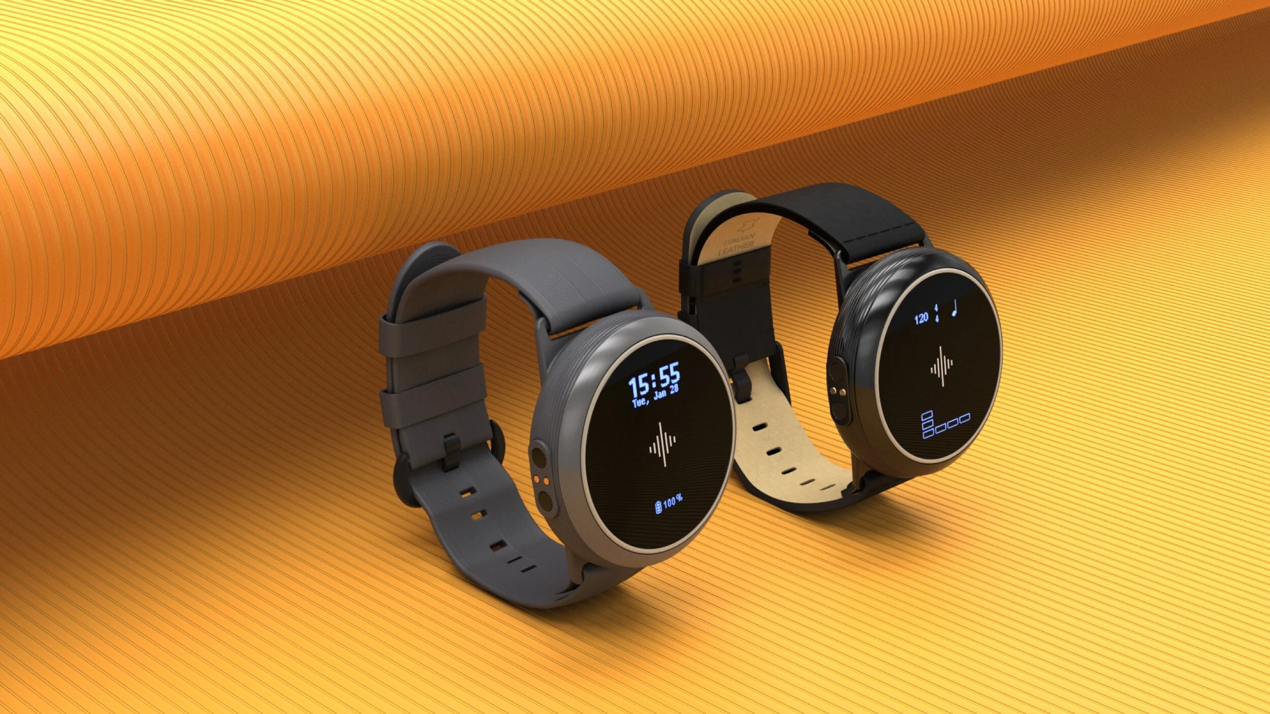
Soundbrenner Core
Product UX/UI and hardware/firmware experience for a wearable metronome line that raised $1.5M through crowdfunding—research, prototyping, hardware interaction testing, and launch-ready visuals and packaging support.
Year
2021
Services
Role
Senior UX designer
Client
Soundbrenner

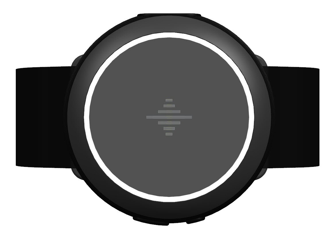
Soundbrenner Core: The Musician's Swiss Army Knife
Designing hardware is a completely different beast than designing software. For 1.5 years, I led the end-to-end product design for the Soundbrenner Core—a 4-in-1 multipurpose wearable featuring a vibrating metronome, contact tuner, decibel meter, and smartwatch. From defining initial features and mapping out firmware logic to designing the companion app and physical packaging, my goal was simple: build a tool that gets out of a musician's way and keeps them in the flow.
100,000+
Units shipped
700,000
Active app users
40
NPS score
Beyond the Metronome
Our previous product, the Pulse, proved that musicians loved feeling the beat via vibrations rather than listening to an annoying click-track. But to stand out in a competitive market, the Core needed to do more. Through user interviews, we uncovered two major pain points:
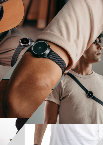
Gear Fatigue
Guitarists hated carrying clip-on tuners everywhere. We solved this by turning the watch into a magnetic contact tuner that's always on their wrist.
Hearing Loss
A musician's most valuable asset is their ears. We integrated a passive decibel meter to warn users of dangerous volume levels. (Fun fact: shortly after we launched this, Apple announced a nearly identical feature for the Apple Watch).
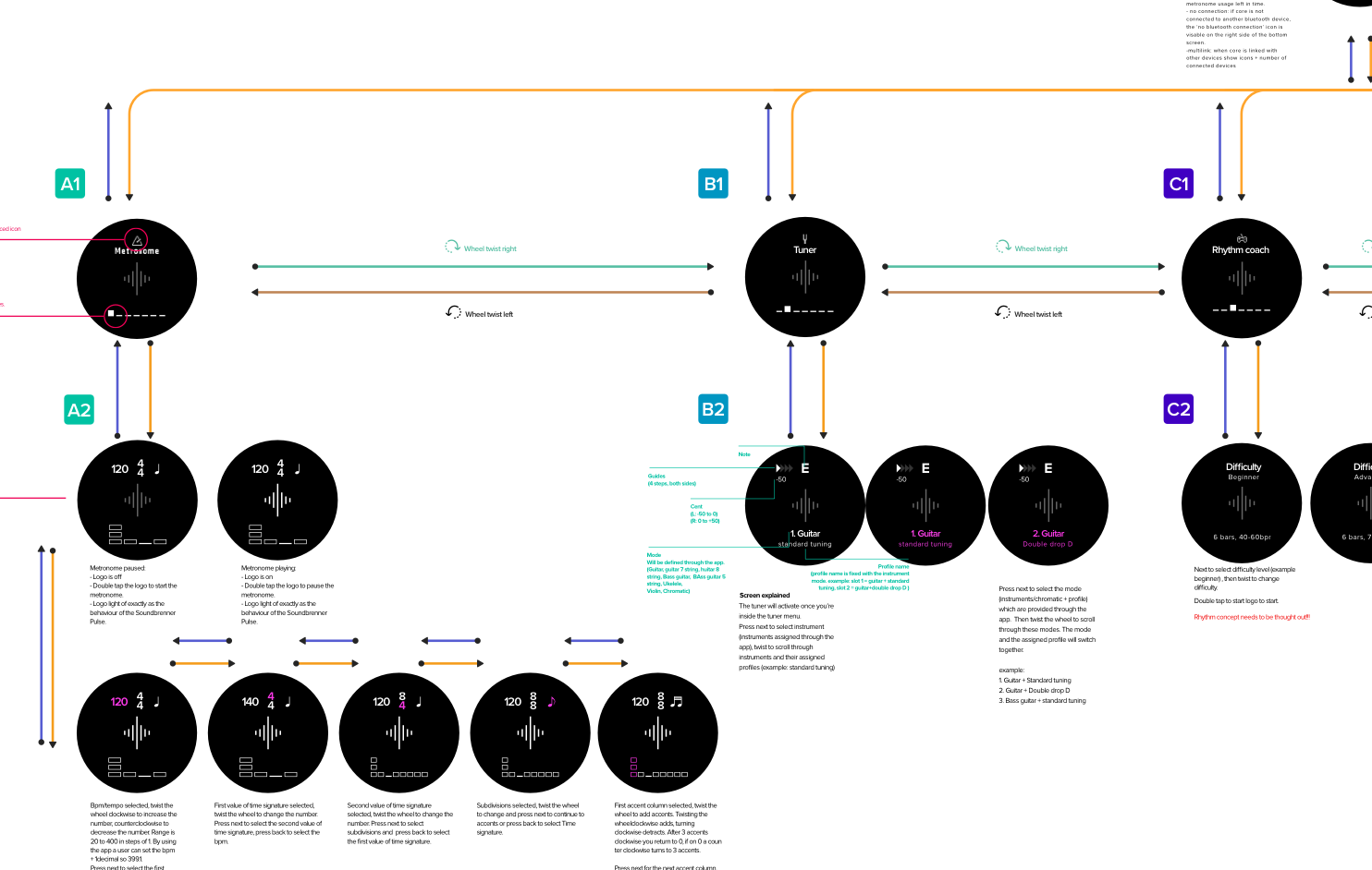
The Challenge: Designing for Extreme Constraints
Designing the Core's UI was an exercise in minimalism. The firmware ran on two tiny 32x96px LCD screens. Furthermore, navigating a 400+ screen flow had to be done using just four physical inputs: a rotating wheel, two buttons, and a capacitive touch sensor.
How Do You Test Hardware That Doesn't Exist yet?
I needed to test my UX assumptions, but we didn't have a functional physical product yet. You can't just hand a user a Figma link for a smartwatch. I had to improvise. I printed out the entire UI flow in a massive 1:1 scale, mimicking the exact physical dimensions of the device's screen.
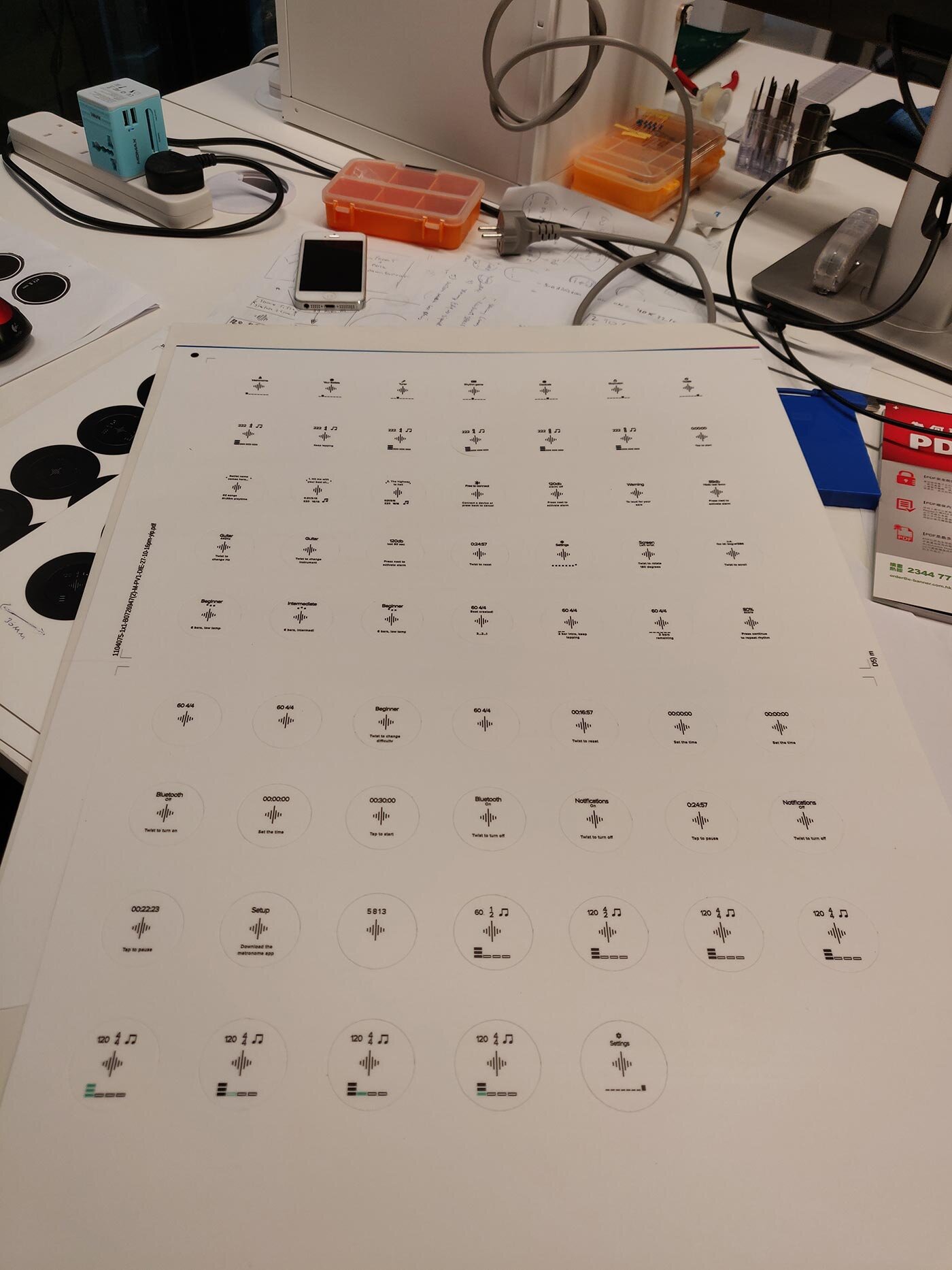
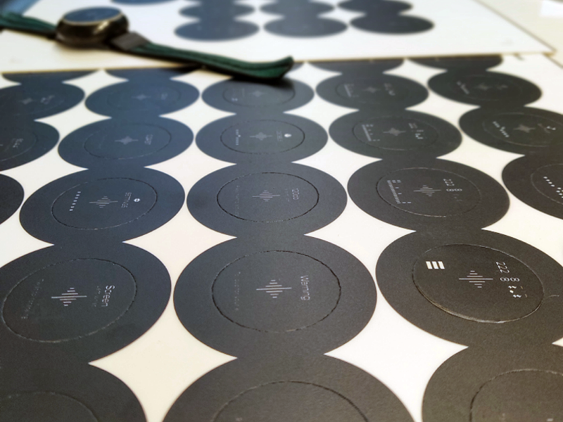
I ran usability tests with musicians of all ages and instruments, tracking task completion rates, time-on-task, and error counts.
“What we learned: Users needed explicit onboarding instructions on how to physically attach the Core to their instruments for tuning. The tuning UI needed stronger visual 'guiding' elements to indicate when a string was perfectly in-tune. Once users learned how to use the wheel and buttons for one task, they immediately understood how to use it for all others. The design system was consistently sound.
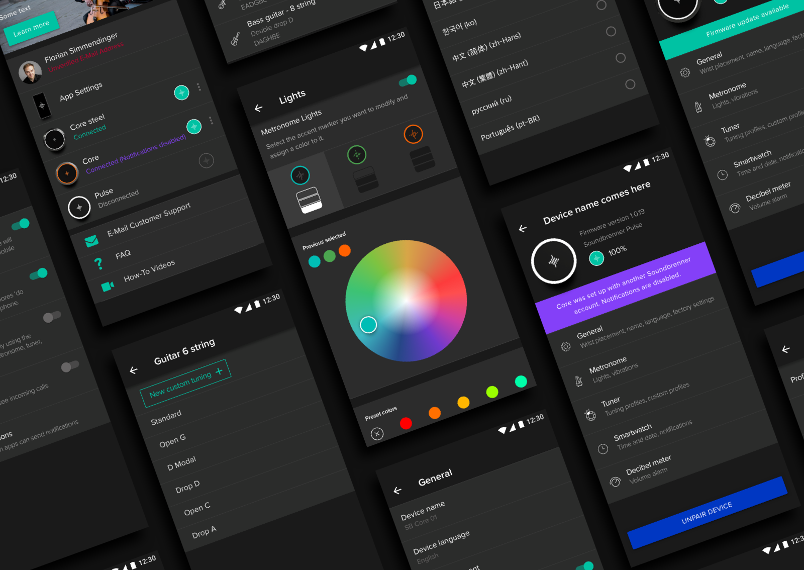
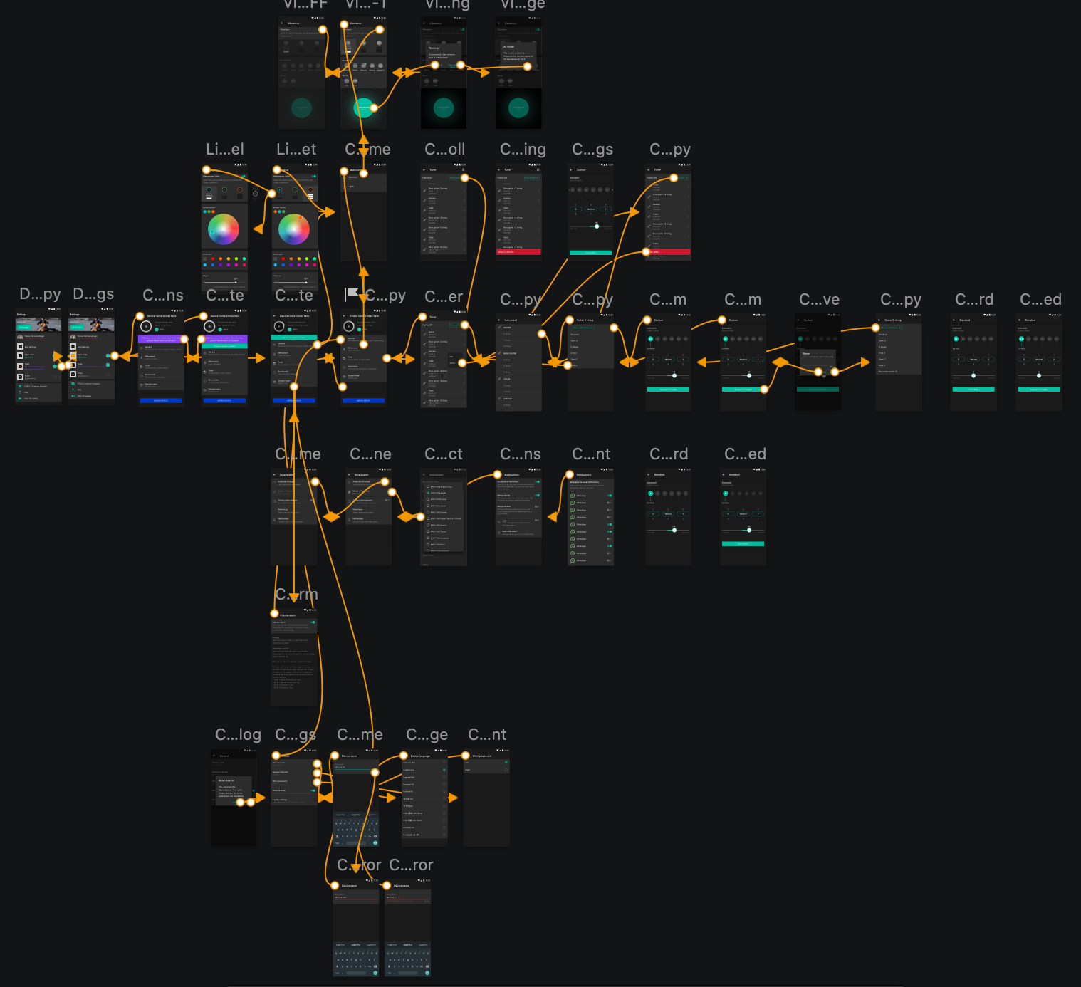
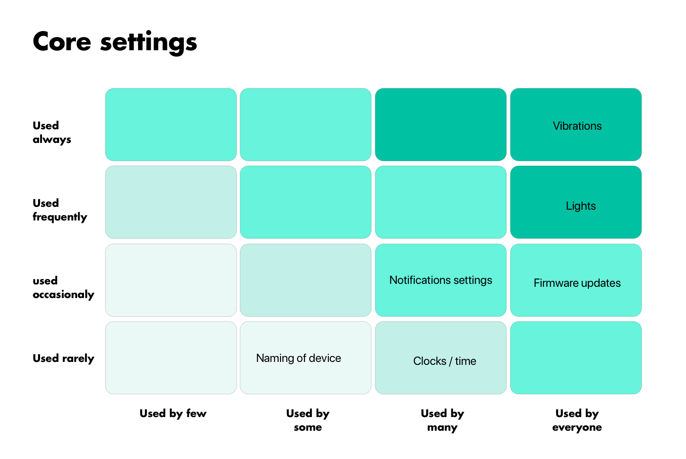
The Companion App: Taming the Settings
Because the hardware UI was so limited, the heavy lifting of customization had to live in our companion app. Users needed to configure lights, haptic strength, decibel alarms, and firmware updates. To prevent the app from becoming a cluttered mess, I used the 'Red Route' matrix to prioritize features based on how often they were used, and by how many people.
A massive focus was placed on an intuitive first-time onboarding experience, which drastically improved our reviews and reduced return rates.
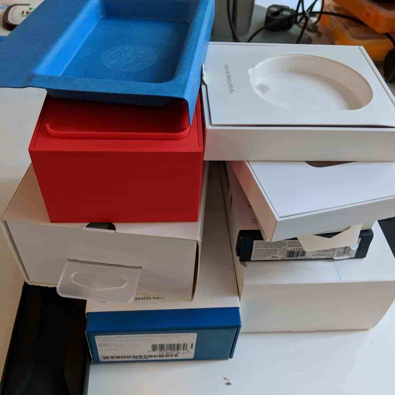
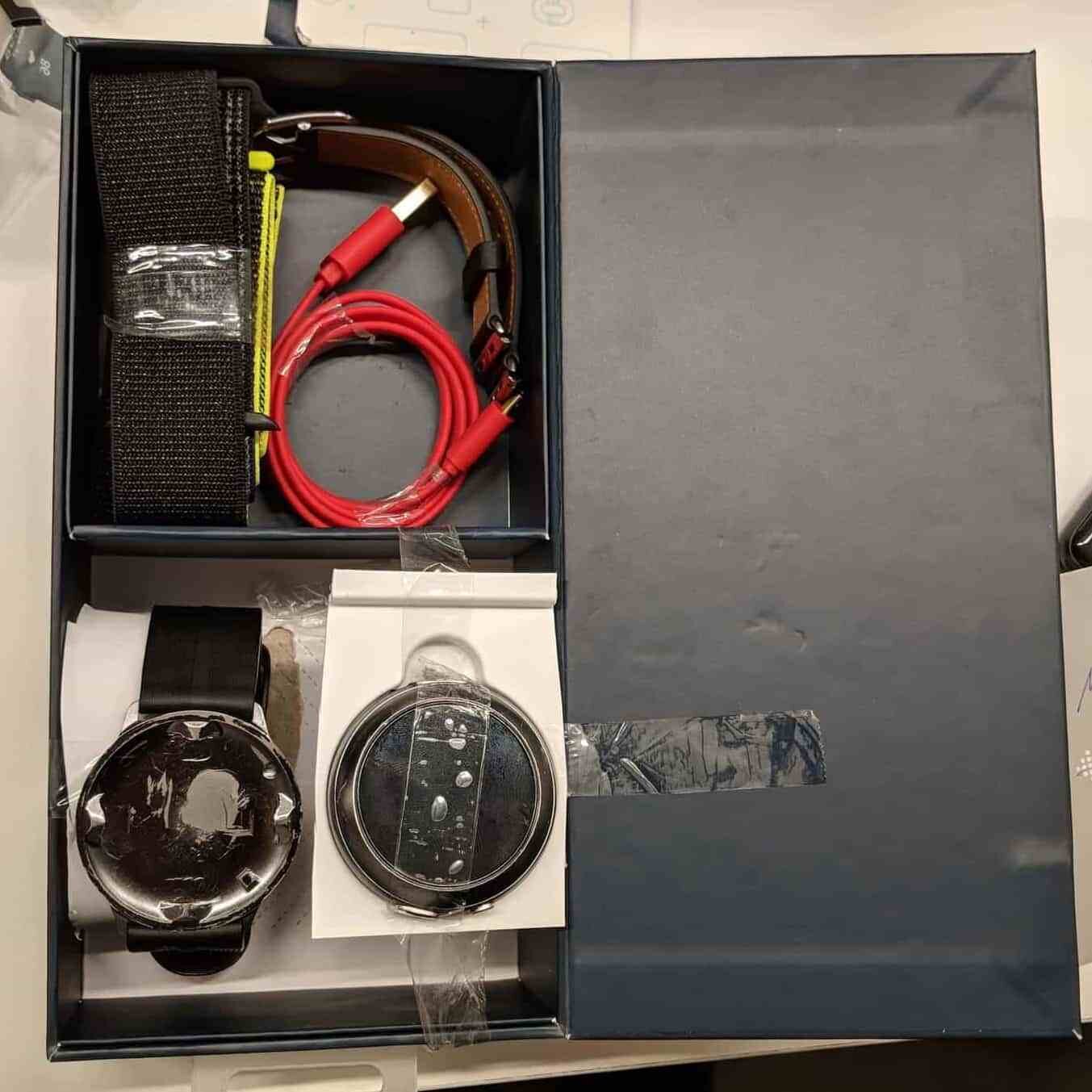
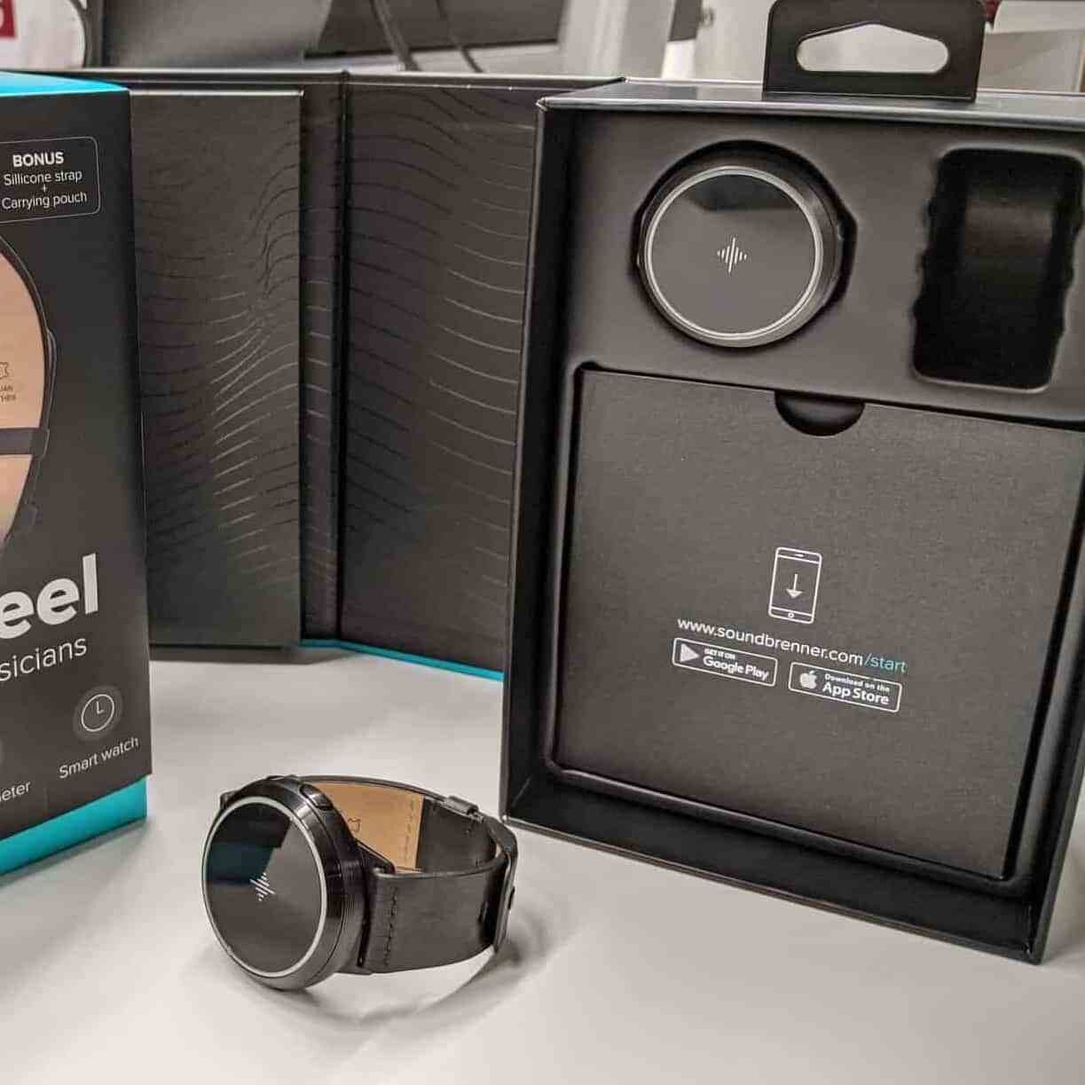
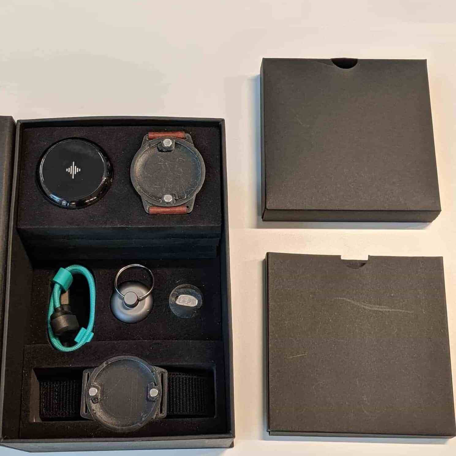
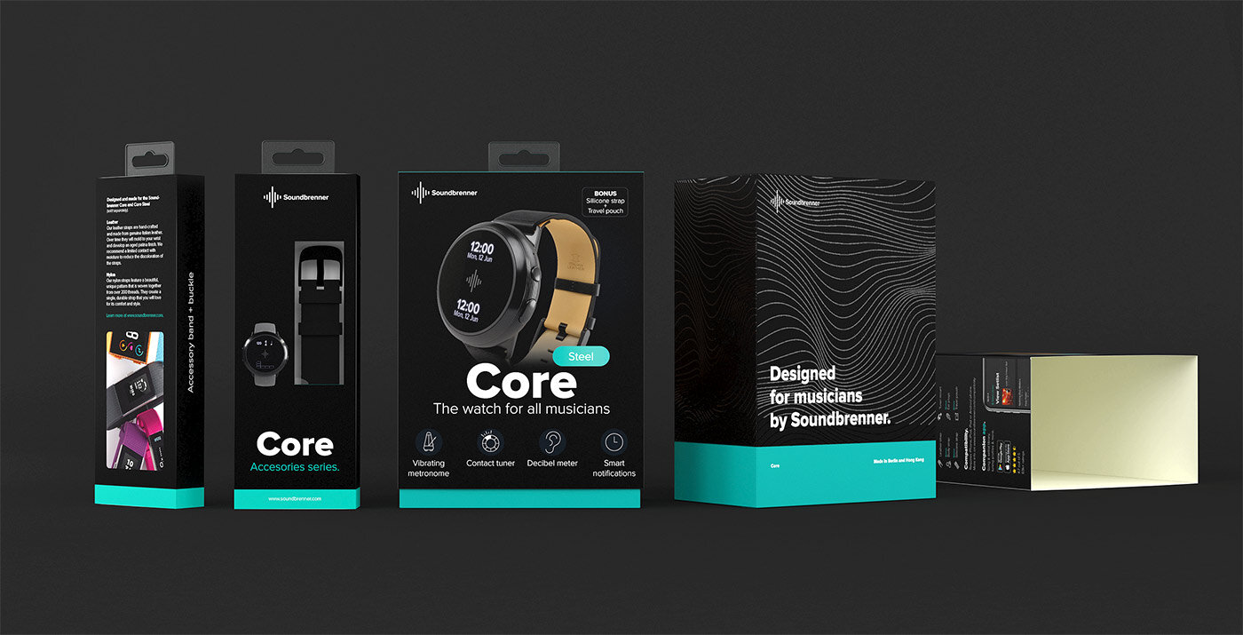
The Final Touch: The Unboxing Experience
My role extended beyond the screen and onto the physical shelf. The packaging needed to feel premium, protect the device, and clearly communicate a complex 4-in-1 tool.
Phase 1
Analyzing dozens of wearable packages to understand market standards and identify opportunities for differentiation.
Phase 2
First structural prototypes from the factory, testing durability and unboxing flow.
Phase 3
Defining the physical layout and accessory placement for optimal presentation and protection.
“Bringing the Soundbrenner Core to life was a masterclass in cross-disciplinary design. By bridging the gap between digital interfaces, physical hardware, and real-world usability testing, we were able to deliver a highly technical tool that actually makes a musician's life easier.